Before
Paris

Buy Before Paris
Before Paris Regular
140 px
0 em
1.2
Florence sur les Champs-Élysées
Before Paris Semibold
140 px
0 em
1.2
Florence sur les Champs-Élysées

Type specimens

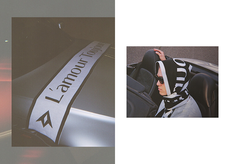
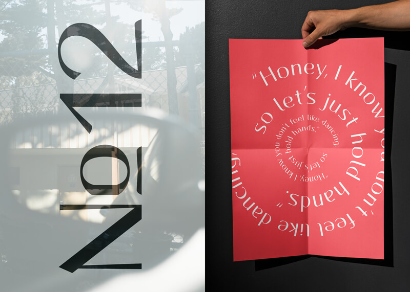
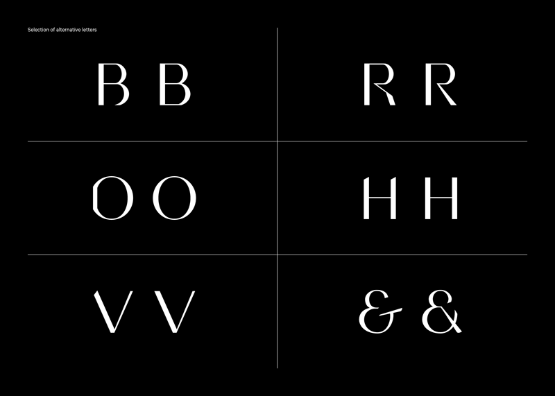
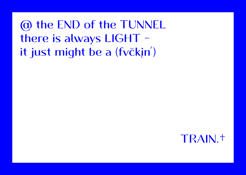
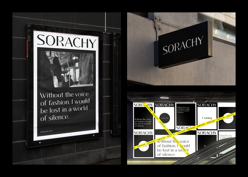
Visual design of Before Paris font by Azuliq. Several words like NYC Boxing Club, Hawaiian Islands, Marshmallow Boy, Premium Quality are displayed. Before Paris font in use. A black and white scarf with the words L‘amour Toujours on a sliver BMW Z3 bonnet. A young man wearing the scarf wrapped around his head. Poster showing Before Paris typeface by Azuliq. Honey I know you don‘t feel like dancing. Packaging design of Before Paris font by Azuliq. A white wine bottle with the words The Electric Chardonnay Acid Test on the label. Example of Before Paris typeface by Azuliq. Several letters and their respective alternative letters are displayed. Visual design of Before Paris font by Azuliq. A quote from a song by the band The Streets: At the end of the tunnel there is always light, it just might be a train. Layout of Before Paris typeface by Azuliq. A cover of a magazine for photography showing a tennis court in California with palm trees in the background. Before Paris font in use by Oliwia Baginska from Warsaw, Poland. The freelance web designer and content curator uses Before Paris for her visual identity. Example of Before Paris font by Azuliq. A visual pattern of the words Punica Granatum, plantes de jardins. Layout of Before Paris typeface by Azuliq. A double-page spread in a magazine summarising Ernest Hemingway‘s most important books. Specimen of Before Paris font by Azuliq. Several branding designs for a fictional Japanese fashion brand are presented.

What the designer says about the typeface

Before Paris is a multi-purpose typeface, which is pushing the boundaries of a classical display font. The typeface offers uppercase and lowercase letters, together with a variety of OpenType features like ligatures and stylistic sets. Before Paris arose as an homage to the French movie “Elevator to the Gallows” (fr. “Ascenseur pour l’échafaud”). This masterpiece by Louis Malle from 1958 is an exciting mix between crime thriller and insane love story. It would later be called the first significant work of the “Nouvelle Vague” (en. “New Wave”). My goal was to recreate the character and the strong atmosphere of “Elevator to the Gallows” in a typeface. In the glyphs you can find multiple hidden references to the title and the hybrid style of the movie—soft and sharp structures colliding as well as parts being cut off or twisted.  /Markus Abts

Selection of glyphs

A
Á
Ă
Â
Ä
À
Ā
Ą
Å
Ã
Æ
B
B
C
Ć
Č
Ç
D
Ð
Ď
E
É
Ě
Ê
Ë
Ė
È
Ē
Ę
F
Fi
G
Ğ
Ģ
H
H
I
Í
Î
Ï
Ì
Ī
Į
J
K
Ķ
L
Ĺ
Ľ
Ļ
Ŀ
Ł
M
N
Ń
Ň
Ņ
Ñ
Ŋ
O
O
Ó
Ó
Ô
Ô
Ö
Ö
Ò
Ò
Ő
Ő
Ō
Ō
Ø
Ø
Õ
Õ
Œ
P
Þ
Q
R
R
Ŕ
Ŕ
Ř
Ř
Ŗ
Ŗ
S
Ś
Š
Ş
Ș
T
TT
Ti
Ŧ
Ť
Ţ
Ț
U
Ú
Û
Ü
Ù
Ű
Ū
Ų
Ů
Ũ
V
V
W
W
Ŵ
Ŵ
X
Y
Ý
Ŷ
Ÿ
Z
Ź
Ž
Ż
a
á
ă
â
ä
à
ā
ą
å
ã
æ
b
c
ć
č
ç
d
ð
ď
e
é
ě
ê
ë
ė
è
ē
ę
f
fb
ff
ffi
ffl
fh
fi
fj
fk
fl
g
ğ
ģ
h
i
i
í
î
ï
ì
ī
į
j
jj
k
ķ
l
ĺ
ľ
ļ
ŀ
ł
m
n
ń
ň
ņ
ñ
ŋ
o
ó
ô
ö
ò
ő
ō
ø
õ
œ
p
þ
q
r
rt
ŕ
ř
ŗ
s
ś
š
ş
ș
ß
t
tt
ŧ
ť
ţ
ț
u
ú
û
ü
ù
ű
ū
ų
ů
ũ
v
w
ŵ
x
y
ý
ŷ
ÿ
z
ź
ž
ż
0
1
2
3
4
5
6
7
8
9
.
,
:
;
!
¡
?
¿
·
*
#
/
-
_
(
)
{
}
[
]
«
»
"
'
@
&
&
§
©
®
°
|
$
¢
£
¥
Ξ
+
×
÷
=
>
<
±
%