copa
nerO

Buy Copanero
Copanero Regular
140 px
0 em
1.2
sOcietY for mExIcan Archaeology
Copanero Italic
140 px
0 em
1.2
sOcietY for mExIcan Archaeology

Type specimens

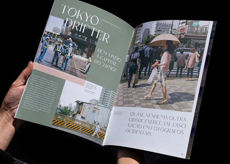
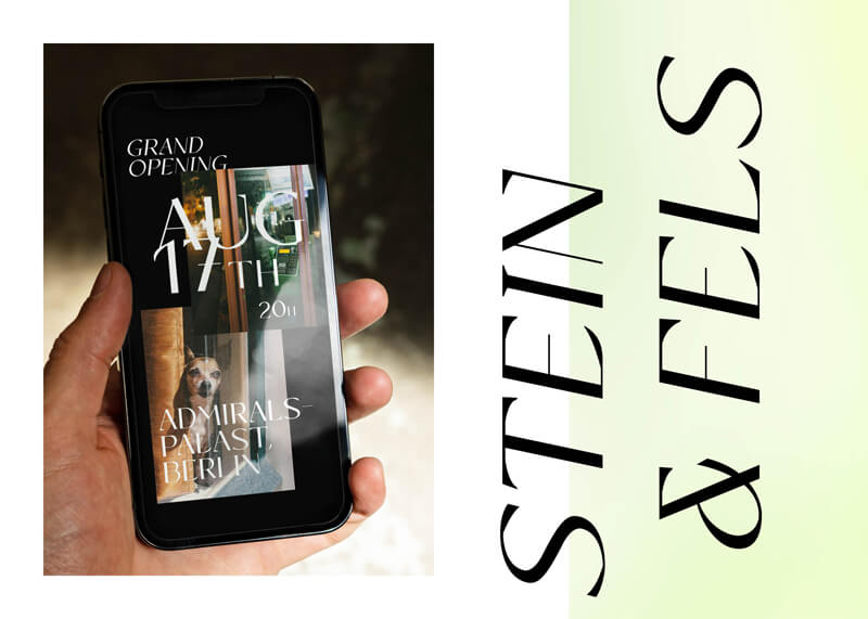
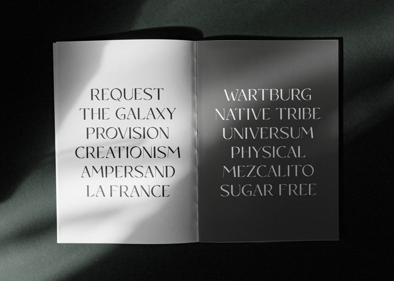
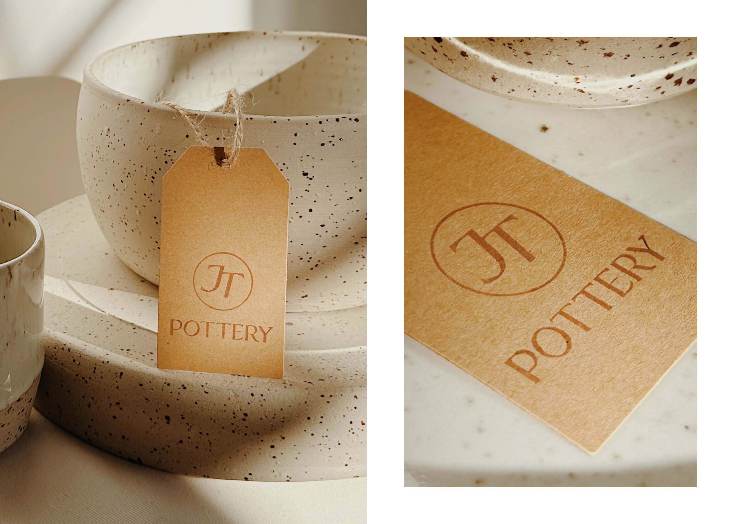
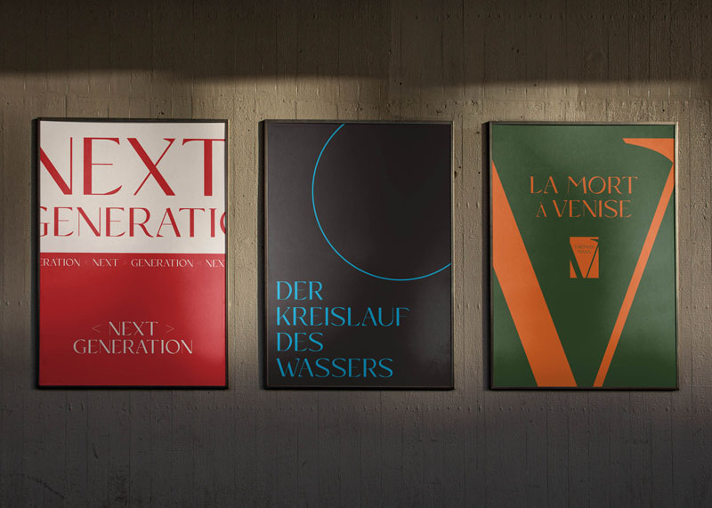
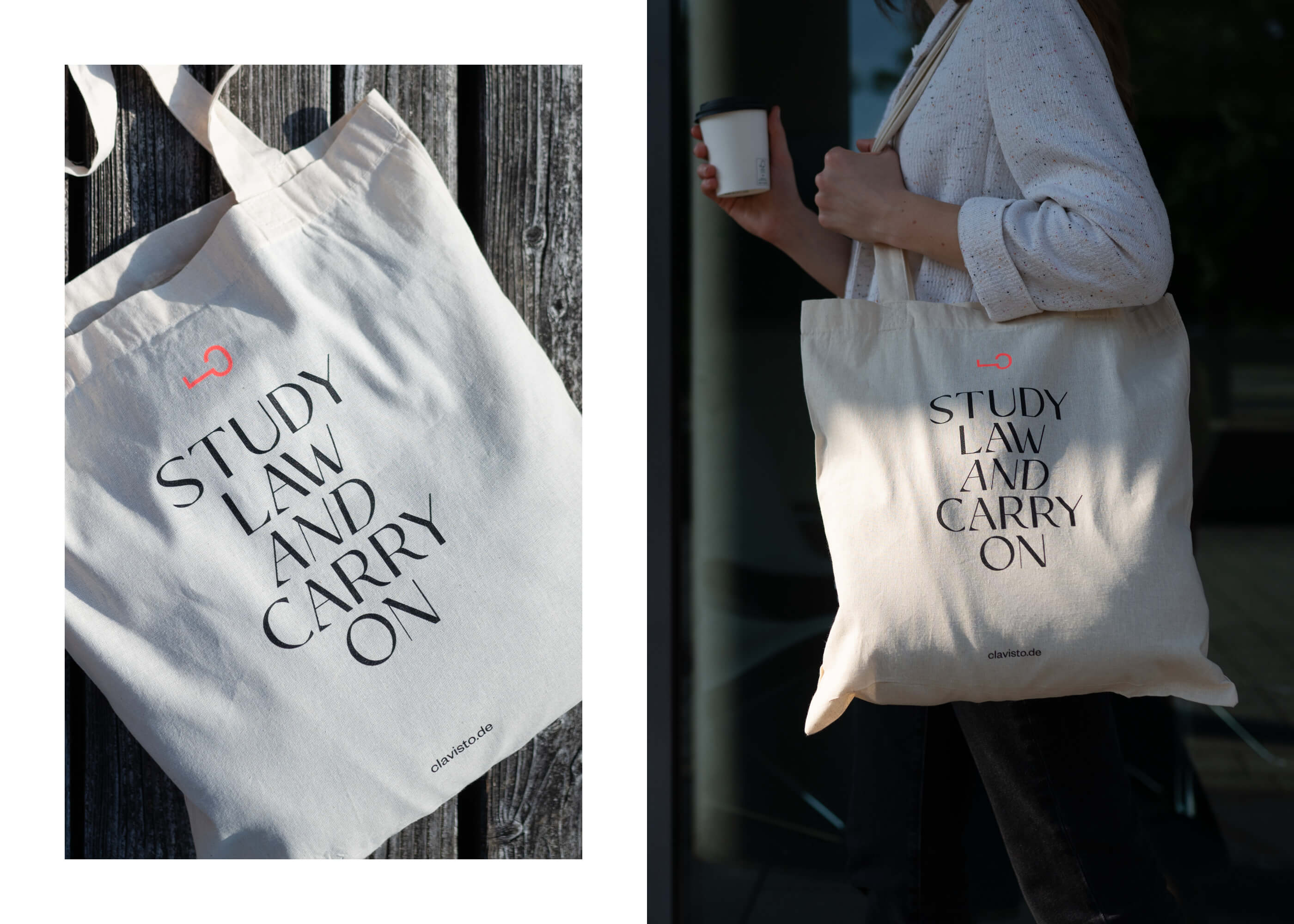
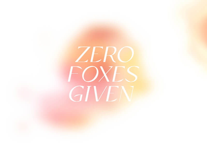
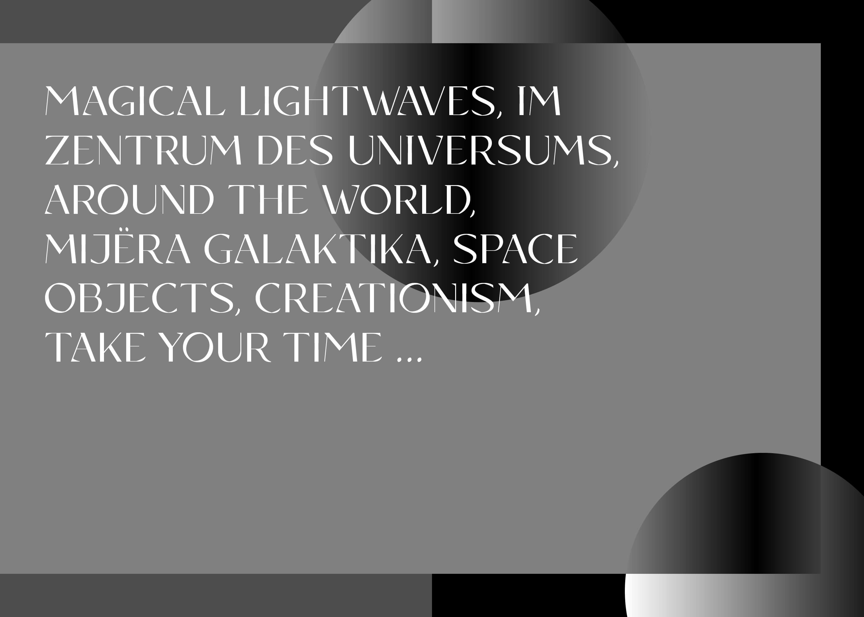
Layout of Copanero typeface by Azuliq. A double-page spread in a magazine shows a travel report about Tokyo, Japan. Headlines and Sublines are designed in Copanero. Copanero font in use by Mauritia Gallery from Berlin, Germany. A man in the jungle wearing a T-shirt that says Embrace The Art Of Nature. UI design of Copanero typeface by Azuliq. A hand holding a mobile telephone with a website about a grand opening in Berlin on the display. Specimen of Copanero font by Azuliq. A double-page spread in a magazine shows several beautiful words, The Galaxy, Physical, Mezcalito, Sugar Free. Visual design of Copanero typeface by Azuliq. The glyph &, also known as ampersand or et ligature. Copanero font in use by The Building & Construction Company from Melbourne, Australia. A blue construction site fence shows the company‘s logo in Copanero. Copanero bespoke font in use by JT Pottery from Cologne, Germany. A brown hang tag attached to a handmade beige bowl shows the company‘s logo in Copanero. Three posters on a wall showing Copanero typeface by Azuliq. Next Generation, Der Kreislauf des Wassers, La Mort à Venise. Copanero font in use by Clavisto from Erkelenz, Germany. A young woman with a coffee in her hand and a white tote bag that says Study Law And Carry On. Visual design of Copanero typeface by Azuliq. ZERO FOXES GIVEN is written on a blurry orange background. Specimen of Copanero font by Azuliq. Digital screen design using a variety of words and phrases related to travel and space. Example of Copanero typeface by Azuliq. Several letters and their respective alternative letters are displayed.

What the designer says about the typeface

The word Copanero itself is a composition of the Brazilian word for prize cup (copa) and the Italian word for black (nero). Just as the name suggests, this classical display typeface was influenced by a variety of impressions I gathered in different places around the world. As you can see from the leaf-like elements in some of the characters, the wonderfully diverse plants and trees of our planet were a special inspiration. I have always loved exploring and the idea of doing things a little differently. For instance, imagine a „copa nero“, a dark cup in between all those shiny gold & silver sports trophies out there. Always challenging the norm, creating something unique that has a positive impact and being in harmony with nature, that is what the name and the typeface stand for. Copanero includes a complete double-set of uppercase letters, offering you a lot of possibilities to do things YOUR WAY.  /Markus Abts

Selection of glyphs

A
a
Á
á
Ă
ă
Â
â
Ä
ä
À
à
Ā
ā
Ą
ą
Å
å
Ã
ã
Æ
æ
B
b
C
c
Ć
ć
Č
č
Ç
ç
D
d
Ð
ð
Ď
ď
E
e
É
é
Ě
ě
Ê
ê
Ë
ë
Ė
ė
È
è
Ē
ē
Ę
ę
F
f
f
G
g
Ģ
ģ
Ğ
ğ
H
h
I
i
Í
í
Î
î
Ï
ï
Ì
ì
Ī
ī
Į
į
J
j
K
k
Ķ
ķ
L
l
Ĺ
ĺ
Ľ
ľ
Ļ
ļ
Ŀ
ŀ
Ł
ł
M
m
N
n
Ń
ń
Ň
ň
Ņ
ņ
Ñ
ñ
Ŋ
ŋ
O
o
Ó
ó
Ô
ô
Ö
ö
Ò
ò
Ő
ő
Ō
ō
Ø
ø
Õ
õ
Œ
œ
P
p
Þ
þ
Q
q
R
r
Ŕ
ŕ
Ř
ř
Ŗ
ŗ
S
s
Ś
ś
Š
š
Ş
ş
Ş
ş
ß
T
t
Ŧ
ŧ
Ť
ť
Ţ
ţ
Ţ
ţ
U
u
Ú
ú
Û
û
Ü
ü
Ù
ù
Ű
ű
Ū
ū
Ų
ų
Ů
ů
Ũ
ũ
V
v
W
w
Ŵ
ŵ
X
x
Y
y
Ý
ý
Ŷ
ŷ
Ÿ
ÿ
Z
z
Ź
ź
Ž
ž
Ż
ż
0
1
2
3
4
5
6
7
8
9
.
,
:
;
!
¡
?
¿
·
*
#
/
-
_
(
)
{
}
[
]
«
»
"
'
@
&
&
§
©
®
°
|
$
¢
£
¥
Ξ
+
×
÷
=
<
>
±
%